

Fast Website Design for Businesses That Converts
August 22, 2026 · 12 min read
Key takeaways
- A fast website helps buyers move from curiosity to contact with less friction, especially on mobile.
- Speed is not only a technical metric; it affects trust, conversion, ad performance, and search visibility.
- The best sites are built around decisions, not decoration: clear offers, strong hierarchy, and fewer dead ends.
- A slow site often hides content, script, image, or workflow problems that also hurt lead quality.
- Fast websites work best when design, copy, SEO, and analytics are planned together from the start.
A sales team can feel this long before a dashboard shows it: a prospect clicks your ad, waits a second too long, and closes the tab before the page even finishes settling. That is usually where fast website design for businesses stops being a nice-to-have and starts affecting pipeline. The problem is rarely one thing; it is the combined effect of loading delays, cluttered layouts, and pages that make people think too hard.
If your site is supposed to generate leads, book calls, or support a paid traffic campaign, speed changes the economics of every visit. The difference between a site that feels immediate and one that drags is often the difference between a casual browse and a qualified inquiry. That is why fast website design for businesses should be treated as a commercial decision, not a visual preference.
Fast website design for businesses starts with the buyer's first click
Most business sites are judged in the first few seconds, not after a tour of every page. A visitor arrives with one task in mind: compare, verify, decide, or leave. If the page loads slowly, shifts around, or hides the next step, the visitor has already started the exit process.
This is why design decisions should begin with the first click, not the homepage mockup. Ask a simple question: what should this person do next, and what might stop them from doing it? When the answer is vague, the page usually becomes full of competing messages, decorative sections, and vague claims that slow the user down even when the code itself is fast.
A useful way to think about fast website design for businesses is to map the shortest path from landing to action. That path may be a contact form, a booking page, a pricing review, or a service explanation. Anything that does not move the user along that path needs a clear reason to stay.
What actually slows a business website down
Speed problems often hide inside decisions that were made for convenience, not performance. Large uncompressed images are obvious, but they are only part of the story. Heavy page builders, too many third-party scripts, oversized animation libraries, and unclear content structures can all make a site feel sluggish.
There is also a slower, less visible kind of drag: decision fatigue. When a page has six calls to action, four competing headlines, and three different design styles, it does not just confuse the visitor. It also makes the page feel heavier because the user has to interpret it before acting.
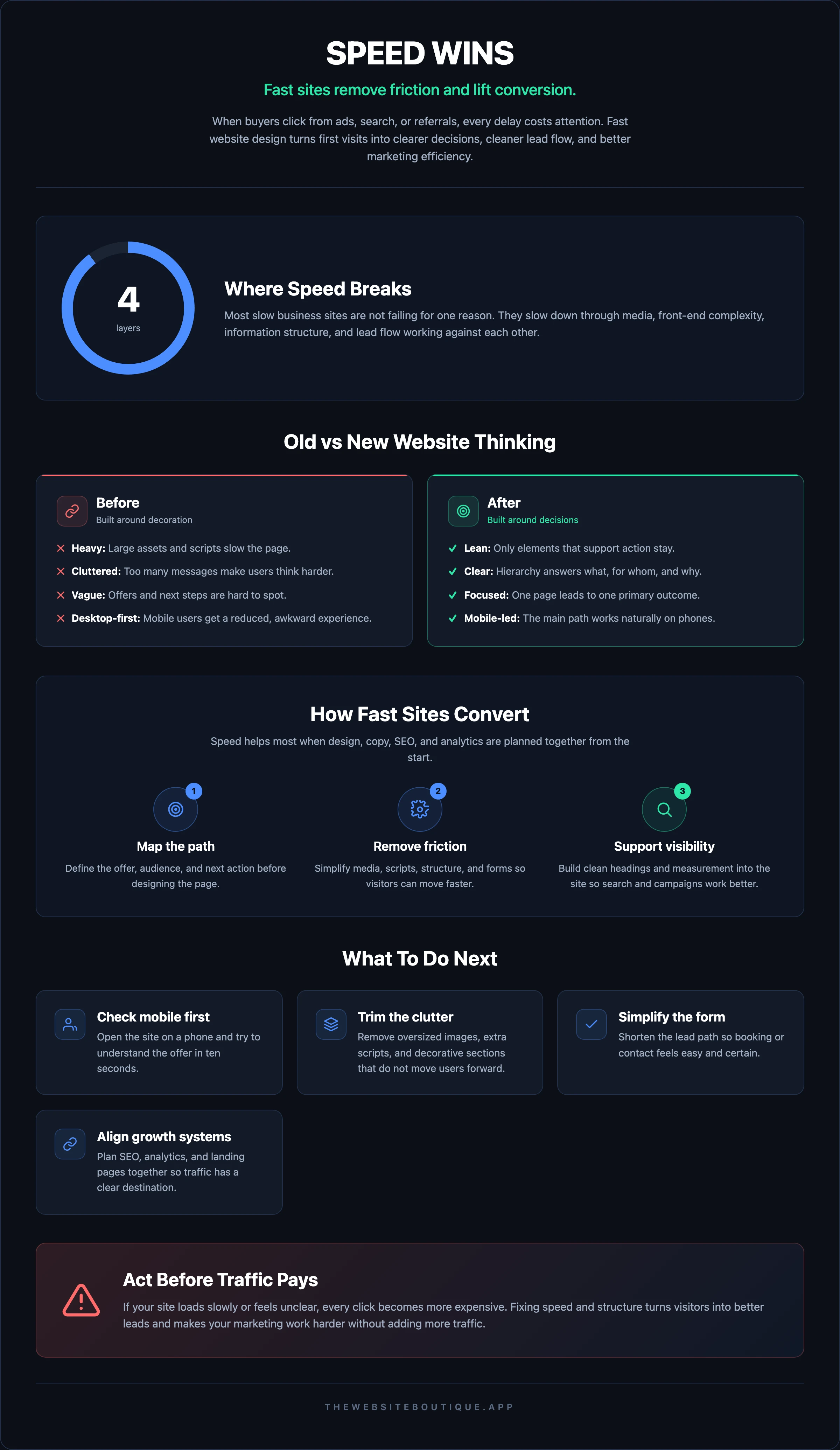
A good team will look at performance in layers:
- Media weight: images, video, embedded assets, and how they are served.
- Front-end complexity: scripts, plugins, fonts, and interaction effects.
- Information structure: how quickly a visitor can understand the offer.
- Lead flow: how many steps it takes to submit, book, or request more information.
The practical point is simple. A site can score well on visual polish and still perform poorly if it is built on unnecessary friction. That is often where businesses that invest in paid traffic lose money without realizing the page is the bottleneck.
For teams that want a more technical reference on page performance, Google’s PageSpeed Insights is useful because it ties loading behavior to measurable diagnostics. It will not tell you what your market wants, but it will show which parts of the experience are underperforming.
The design choices that improve speed and conversion together
The best-performing business sites usually look simpler than people expect. That is not because simplicity is trendy; it is because clarity loads faster. When the layout, messaging, and actions are tightly aligned, the page feels lighter and the user moves faster.
Start with hierarchy. A visitor should see the offer, understand who it is for, and know what to do next without scrolling through a presentation. The first screen needs to answer the obvious questions: what do you do, who is it for, and why should I care now?
Use fewer elements, but make each one earn its place
Every extra component adds weight, even when it looks harmless. Auto-play video, animated counters, oversized sliders, chat widgets, multiple fonts, and decorative sections can all slow down the page or distract from the action.
A useful rule is to keep one page focused on one primary outcome. If the page exists to generate qualified leads, then testimonials, service details, proof points, and a strong form are enough for most cases. If the page tries to sell every service at once, it usually gets slower in both performance and persuasion.
Write for scanning, not for page length
Readable copy helps speed because it reduces the time needed to understand the offer. Short paragraphs, concrete subheads, and visible proof help the visitor decide sooner. That matters even when the technical load time is good, because perceived speed includes cognitive effort.
You do not need to write like a brochure. A service page that says exactly what is delivered, how the process works, and what the next step is will usually outperform a page that sounds polished but vague. For businesses that rely on outbound or paid traffic, this is one of the biggest gains available from fast website design for businesses.
Make mobile the default design lens
Many buyers will meet your brand first on a phone, especially if the site is tied to ads, social content, or email. A desktop-first layout that collapses badly on mobile is not just ugly; it can bury the CTA, make text hard to scan, and stretch interactions into a chore.
The mobile version should not feel like a reduced version of the desktop page. It should be the main decision path, with content blocks ordered to match how a mobile user actually behaves. If the important action is buried under large banners or long hero sections, the page is slower in business terms even if it loads quickly.
If you want to compare how a fast site is typically packaged for service businesses, Fast Websites shows a practical example of a build process centered on speed and conversion rather than decorative complexity.
Speed affects SEO, ads, and AI search visibility
A fast site does not only help the person already on the page. It also changes how your marketing channels behave before the click. Paid ads land more efficiently on a page that loads cleanly. Search engines can crawl and render it with less friction. And AI-driven discovery systems tend to reward pages that are easy to parse, concise, and structurally clear.
For SEO, speed is one signal among many, but it is a meaningful one when the site has to compete on a crowded query set. Search engines care about whether the page can serve users well, and loading performance is part of that experience. Google’s Search Central is worth reviewing if your team wants the official view on how technical quality and content quality work together.
The newer question is how your site appears in AI-assisted search experiences. If a page is bloated, unclear, or buried under generic copy, it becomes harder for systems and people to identify what it actually offers. That matters for businesses trying to be found through modern search behaviors, not only classic blue links.
This is where fast website design for businesses connects directly to visibility. A page that is lean, specific, and organized with clean headings gives search systems better material to interpret. It also gives your team better content to reuse across ads, email, and sales follow-up.
If search visibility is part of your growth plan, The Website Boutique’s SEO + AI Search (GEO) page is a good starting point for understanding how traditional search and AI discovery can be aligned instead of treated as separate projects.
The build process that avoids rework later
A fast site is easier to build when the decisions are made in the right order. Teams often start with visual design and only later discover that the content structure, SEO requirements, or lead flow do not fit the layout. That is how projects become slower, more expensive, and less effective.
A cleaner approach is to define the offer, the audience, and the conversion path before polishing the interface. That usually means agreeing on what the homepage must do, which service pages matter most, and what proof is available to support the claims. Once that is clear, design can do its real job: making the path easier to follow.
A solid build workflow often includes:
- A content map tied to business goals.
- A lightweight component system instead of one-off page elements.
- A performance check during development, not after launch.
- SEO and analytics setup before traffic starts.
- Testing on real mobile devices, not just in a browser preview.
This matters because rework is expensive in more ways than one. A page that looks finished but needs structural changes later often ends up with extra code, duplicated content, and slower edits for the marketing team. In a business setting, that kind of drag makes the site harder to improve over time.
If you need examples of how different businesses use a site within a broader growth system, the Use Cases page can help you see how fast sites fit into lead generation, positioning, and service delivery.
How to evaluate whether your current site is fast enough
A site does not need to be perfect to be useful, but it does need to be fast enough for the work it is supposed to do. If your traffic is mostly warm referrals, a few delays may be tolerable. If you rely on paid campaigns, competitive search, or high-intent prospects, the tolerance is much lower.
Look for warning signs that the website is underperforming:
- Important sections take too long to appear on mobile.
- The page jumps while content loads.
- Forms feel long or uncertain.
- The design looks good, but people still do not convert.
- Marketing campaigns drive clicks, but the site does not turn them into action.
A useful test is to compare what you think happens with what a first-time visitor actually experiences. Open the site on a phone connection, not a fast office Wi-Fi network. Try to understand the offer in under ten seconds. Then try to complete the main action without hunting for it.
If the process feels even slightly uncertain, the page is probably costing you more than it appears. That is especially true for businesses that pay for traffic, because the site becomes part of the media cost. A slow or confusing landing page makes every click work harder than it should.
For teams that also want a broader growth system, Get leads shows how paid media and landing page structure can work together instead of operating as separate efforts.
When to rebuild, when to improve, and when to leave it alone
Not every website needs a full rebuild. Sometimes the right move is to fix a few high-friction areas: replace oversized images, simplify the homepage, tighten the form, or remove scripts that no longer serve a purpose. Other times the structure is so tangled that incremental fixes are just a slower version of starting over.
A rebuild makes sense when the current site cannot support your commercial goals without major compromise. That usually happens when the layout is outdated, the content hierarchy is weak, or the technology stack makes simple changes painful. If every improvement requires workarounds, the site is already creating operational cost.
An improvement project is enough when the core structure is sound and the site mainly needs tuning. That may include content cleanup, performance optimization, better page order, or a simpler conversion path. These changes are often the highest-return moves because they reduce friction without forcing the business to re-platform.
Sometimes the honest answer is to leave the site mostly alone and direct effort elsewhere. If the site already loads well, explains the offer clearly, and supports the sales process, it may not deserve a large redesign. In that case, the focus should shift to traffic quality, search presence, and lead handling.
When a team needs both the site and the acquisition system to work together, a senior partner helps because the design decisions stop being aesthetic guesses and become business choices. That is the kind of work The Website Boutique usually focuses on: a site that loads quickly, supports search, and is built to convert without dragging the team into avoidable complexity.
If you want a sense of the team behind that approach, About explains how the agency works with U.S. businesses in the same time zone, while Clients shows the kind of growth-focused projects they support.
Frequently asked questions
How fast should a business website be?
Fast enough that visitors can understand the offer and take the next step without noticeable friction. The exact number depends on the page type, content, and device, but the real test is whether the site feels immediate and easy to use.
Does a faster website always convert better?
Not always, but it usually removes one of the main reasons people abandon a page. If the message, offer, and form are weak, speed alone will not fix conversion. It works best when paired with clear structure and strong copy.
What is the biggest mistake companies make with speed?
They treat it as a technical cleanup task after design is finished. By then, the page may already be full of heavy sections, duplicate calls to action, or content that was never built for mobile-first behavior.
Can a site be visually strong and still be too slow?
Yes. Decorative effects, large media files, and too many scripts can make a polished site feel sluggish. Visual quality and performance need to be designed together.
Should I rebuild my site or optimize the current one?
If the structure and content are basically sound, optimization is usually the smarter first move. If the site is hard to edit, poorly organized, or built around the wrong conversion path, a rebuild may save time and money over the long run.
Ready to turn your website into a faster path to leads instead of a bottleneck? If the current site is slowing down paid traffic, search performance, or the sales team’s follow-up process, let’s fix the parts that matter most.
If you want a site built for speed, clarity, and conversion, Get a site that converts. And if your growth plan also includes search visibility and lead generation, you can pair it with Get found or Get leads so the website supports the rest of the funnel instead of fighting it.