

Fast Website Design for Businesses: FAQs and Practical Tips
August 27, 2026 · 10 min read
Fast Website Design for Businesses: FAQs and Practical Tips
- A fast site should help a visitor decide, not just impress them visually.
- Many business websites are slow because too many decisions get made too late.
- The best builds start with page purpose, content order, and load-time discipline.
- Speed affects trust, lead quality, and how often people finish a form.
- If your site is a sales tool, every extra second has a cost.
A client rarely says, “I need a prettier homepage.” More often, the real problem shows up in the first phone call: people are finding the site, but they are not staying long enough to ask for a quote, book a call, or read the offer. That is where fast website design for businesses changes the conversation. The goal is not decoration; it is to help a visitor understand what you do, trust you quickly, and take the next step without friction.
Speed matters because attention is already fragile before the page loads. If a homepage feels slow, the rest of the experience starts at a disadvantage. If the structure is messy, even a fast page can feel difficult. The businesses that get the most from a new site usually treat speed, clarity, and conversion as one decision, not three separate projects.
What fast website design for businesses actually means
A fast site is not only a technically lightweight site. It is a website that feels easy to use, loads quickly on real devices, and does not force the visitor to work to understand the offer. That includes image weight, layout discipline, mobile behavior, and the number of distractions on each page.
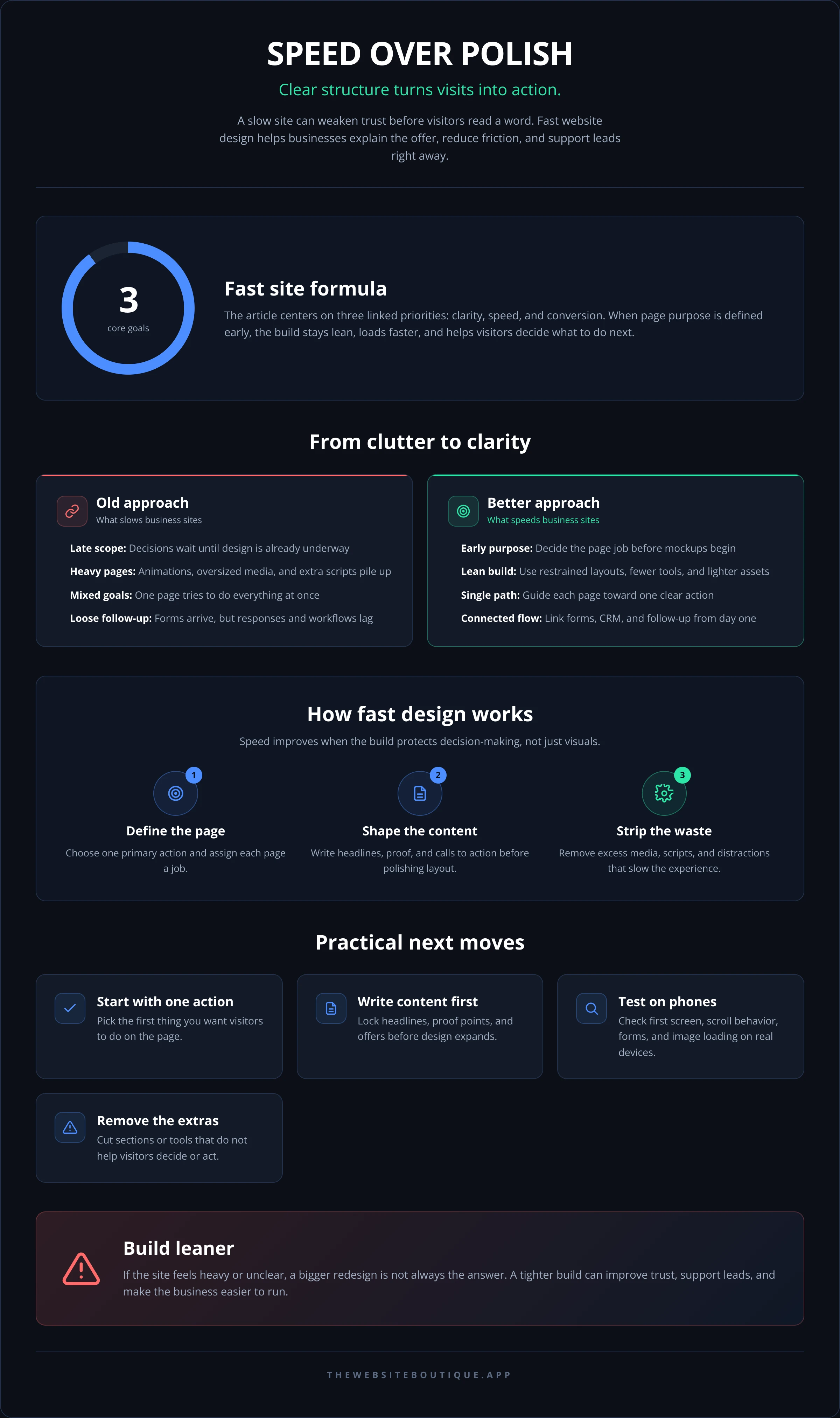
Good fast website design for businesses usually begins with one question: what should this page do first? A landing page might need to get a lead. A service page might need to earn trust and answer objections. A homepage may need to route people to the right service without making them think too hard. When page purpose is clear, the build gets simpler and faster.
That simplicity is often what owners underestimate. They expect speed to come from a few technical fixes, but the layout choices matter just as much. Heavy animations, stacked scripts, oversized media, and too many competing calls to action can slow down both the page and the decision.
If you want a reference point for the type of site experience this article is talking about, look at fast websites built in two weeks. The point is not the timeline alone; it is that a site can be planned tightly enough to remove the usual drift.
Fast website design for businesses starts before design
The first bottleneck is almost never visual design. It is unclear scope. Owners often ask for “a new site” when what they actually need is one main conversion path, a few supporting pages, and content that answers buyer questions in the right order. If those decisions wait until after design has started, the project slows down and the site usually gets heavier.
A cleaner approach is to decide three things first:
- Which page is meant to convert.
- Which page is meant to educate.
- Which page is meant to filter out the wrong inquiries.
That sounds simple, but it prevents a lot of expensive rebuilding. For example, a service page that tries to be a homepage, a brochure, and a blog post at the same time tends to load with more sections, more copy, and more choices. Visitors feel that confusion instantly.
This is also why the content outline matters before the mockup. Headline hierarchy, proof, service details, and the form all need to be placed deliberately. If the structure is right, the design can stay lean. If the structure is vague, the page gets padded with visual fixes that do not help performance.
For businesses that need a tighter process, it often helps to see how the workflow is organized in services or review use cases to match the site to the actual sales motion.
The design choices that slow a site down
A slow website is usually the result of many small decisions that each seem harmless on their own. A hero video may look polished, but if it delays the first meaningful view on mobile, it can hurt engagement. Large image galleries can make sense for a portfolio, but not if every image is uploaded at full size with no compression. Pop-ups, third-party widgets, and tracking tools can also stack up quickly.
Some of the most common slowdowns are easy to miss because they happen behind the scenes:
- Uncompressed images saved far larger than needed.
- Custom fonts loaded in too many weights.
- Repeated animation libraries and unused plugins.
- Excessive scripts from chat widgets, forms, or embeds.
- Sections added “just in case” that the visitor never uses.
Mobile makes the impact more visible. A page that feels fine on a desktop connection may feel clumsy on a phone with an average network. That is where a careful build beats a flashy one. Owners often notice this only after watching real users abandon a form halfway through, or after seeing that people scroll past the offer and never return.
Technical speed tools help, but they are not a substitute for restraint. Google’s own PageSpeed Insights is useful because it shows where a page is wasting time, not just whether it feels slow. For deeper standards, Web.dev is a solid reference on performance, accessibility, and user experience.
Questions to ask before you hire a designer
A lot of wasted time comes from the wrong early questions. Instead of asking only when the first mockup will be ready, ask what the build process is protecting. A strong team should be able to explain how they avoid bloat, how they handle mobile layouts, and how they decide which features are worth adding.
Useful questions include:
- How do you keep the site fast without stripping out what matters?
- What happens if the content changes halfway through the project?
- How do you handle revisions so the page does not become cluttered?
- Which parts of the build are custom and which are reused for efficiency?
- How do you measure whether the page is actually helping leads?
The answers tell you more than a portfolio does. A pretty site can still be slow, hard to update, or confusing to use. What you want is a team that understands the tradeoff between flexibility and speed and can explain it plainly.
If the agency or studio only talks about “modern design” and never about page weight, mobile behavior, or conversion paths, that is a warning sign. So is a process that starts with visual inspiration before the offer and audience are defined. A faster project usually comes from fewer rework cycles, not more meetings.
For owners comparing different working styles, it can help to review pricing and work to see how scope and build quality are usually framed. The structure matters because a site built quickly should still feel deliberate.
How speed supports leads, trust, and follow-up
A fast site does more than load quickly. It changes the way a lead moves through the page. If someone is comparing vendors, they are using signals: clarity, confidence, and ease of action. When the page responds quickly and the message is focused, the visitor is more likely to continue.
That matters even more when the site is tied to ads or direct outreach. Paid traffic is expensive attention. If a landing page takes too long to become useful, you are paying for clicks that never get a fair chance to convert. This is why businesses that run campaigns often need their site, landing page, and follow-up system planned together rather than separately.
A practical example: if the homepage exists mostly to support credibility, but the lead form sits on a separate landing page, both pages should be built with different jobs. The homepage should move quickly through what you do, who it is for, and why you are credible. The landing page should remove distractions and make the next action obvious. That is where landing pages and lead generation connect instead of competing.
The follow-up also matters. If leads are coming in, but no one responds quickly or consistently, the site loses value. Tools that connect forms to CRM workflows can help the business move faster after the click. For some owners, that means integrating a simpler workflow before chasing more traffic.
When teams think only about launch day, they miss the real return. A site is not finished when it goes live; it is finished when it can support the sales process without slowing people down. That includes search visibility, especially when buyers are using AI-assisted search or asking tools for recommendations. For businesses that want both search and AI discoverability, SEO and AI search (GEO) becomes part of the same performance conversation.
A practical checklist for a faster build
There is no magic formula, but there is a reliable sequence. If you are planning a new site or a rebuild, use a checklist that keeps the project focused before it gets heavy.
Start with one primary action
Decide what the visitor should do first. Book a call, request a quote, fill out a form, or read a service page. If the page has three competing goals, it will usually convert worse and take longer to build.
Write the content before polishing the layout
Headlines, proof points, service details, and calls to action should be clear before the visual work expands. This keeps the page from being redesigned around missing content later.
Keep the visual system simple
One or two fonts, a controlled palette, and consistent spacing rules go a long way. A restrained system is easier to load, easier to maintain, and less likely to break on mobile.
Test on real devices early
A site that looks fast on a laptop may not feel fast on an average phone. Check the first screen, scroll behavior, form behavior, and image loading in conditions that resemble actual use.
Remove anything that does not support the goal
Every section, script, and widget should earn its place. If it does not help the visitor decide, trust you, or act, it is probably just adding weight.
If you want to compare this kind of focused build with other service offerings, About and free resources are useful starting points. For readers who are comparing multiple service models, The Website Boutique and The Website Boutique blog can provide context without forcing a sales call too early.
FAQ about fast website design for businesses
How fast should a business website be?
Fast enough that the visitor can understand the page and act without waiting through obvious delays. The exact technical number matters less than the experience on a phone, because that is where many business visitors will first judge the site.
Does a faster site automatically convert better?
No. A faster page still needs a clear offer, strong structure, and a convincing next step. Speed removes friction, but it does not fix weak messaging or a confusing sales path.
What should I prioritize if I only have time for one improvement?
Start with the page that gets the most traffic or the page that is most important to your sales process. Then remove whatever slows understanding: oversized media, cluttered sections, or too many calls to action.
Is custom design always slower to build?
Not necessarily. A custom site can be efficient when the scope is tight and the structure is clear. Problems usually appear when “custom” means everything is reinvented without a plan.
Can I keep my site fast if I need forms, scheduling, and analytics?
Yes, but every tool should be chosen carefully. Useful features can still be added without turning the page into a bundle of scripts and distractions. The question is whether each tool helps the visitor or just adds overhead.
Where should I get help if my current site is slow and messy?
Look for a team that talks about speed, conversion, content structure, and follow-up together. If you need a rebuild that is designed to stay lean, fast website design for businesses is the kind of service to review, especially if your site needs to support leads rather than just look current.
If your site is already bringing in traffic but the page feels heavy, unclear, or hard to act on, the next move is usually not a bigger redesign. It is a tighter one. Start by reviewing the page that matters most, then decide what should disappear before adding anything new.
If you want help with a site that loads quickly, makes the offer obvious, and supports real follow-up from day one, explore The Website Boutique services or book a look at current work. The right build should make the business easier to run, not harder to manage.