

Fast Websites for Businesses: Common Mistakes
September 06, 2026 · 12 min read
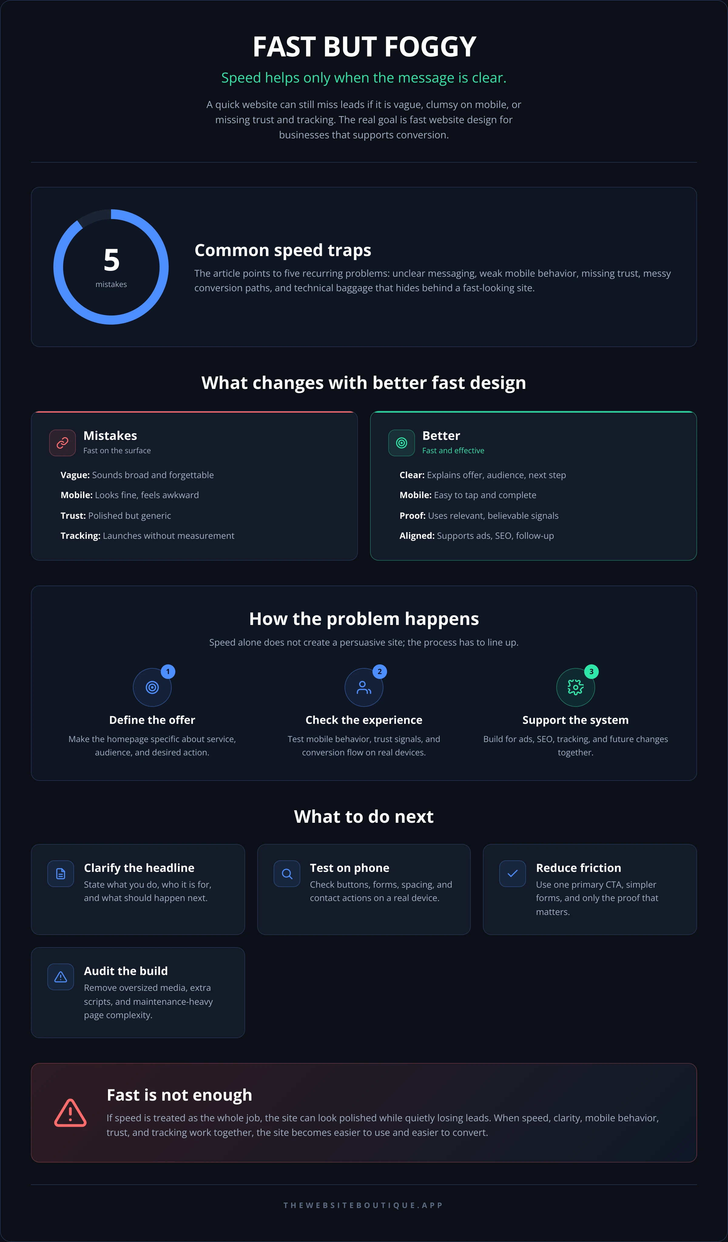
- Speed only helps if the site still makes it obvious what the business does, who it serves, and what to do next.
- Most slow-converting business sites are not failing because of one big issue; they are failing because of small choices stacked together.
- A fast site without clear messaging, good mobile behavior, and proper tracking can look polished while quietly missing leads.
- Templates can be useful, but a business site still needs decisions made around offers, calls to action, and page structure.
- If ads, SEO, and follow-up matter to your business, site speed should support the whole system—not sit apart from it.
You launch the site, open it on your phone, and it feels quick. Then the calls do not come in, the form submissions stay flat, and the ad spend keeps doing what ad spend does when the page is weak: it exposes the weak page. That is where fast website design for businesses gets misunderstood. Speed matters, but speed alone does not make a site persuasive, clear, or usable.
For owner-operated businesses, the real problem is usually not that the website is slow. It is that the site tries to do too much, says too little, or forces the visitor to work too hard. A fast page that confuses people is still a problem. A slower page that answers the right questions quickly can outperform it if the structure is better.
The Speed Trap That Hurts Business Sites
A lot of owners ask for a site that “loads fast” because they have felt the pain of a bloated old website. That is a fair concern, but fast website design for businesses should be treated as a business decision, not a technical trophy. If you optimize only for speed scores, you can end up stripping away useful content, helpful trust signals, or the kind of friction that helps qualified visitors feel safe reaching out.
The mistake usually starts with a template that looks clean in a demo and then gets packed with extra sections, multiple fonts, heavy animations, and oversized media. The site still looks modern, but every layer adds delay and distraction. For a small business, that does not just affect page load time; it affects whether the visitor understands the offer before patience runs out.
Another common issue is treating the homepage like a brochure. The page loads quickly, but it does not answer the questions a buyer actually has: What is this company? Who is it for? Why should I trust them? What should I do next? If those answers are not visible fast, the technical speed did not buy you much.
Fast Website Design for Businesses Starts With the Offer
Speed fixes the delivery. It does not fix the offer. If the visitor lands on a page that is technically fast but vague about service, location, scope, or outcome, they will leave just as quickly as they arrived.
One of the most damaging mistakes is trying to sound broad enough to appeal to everyone. That usually creates a homepage headline that could belong to twenty different businesses. A better approach is to make the page specific enough that the right visitor recognizes themselves immediately. That clarity is especially important for service businesses competing in search, paid ads, or referrals.
The visitor should not have to decode the business from scattered sections. A strong homepage tells them, in a few seconds, what the company does, who it serves, and what action to take. If that part is weak, even the best load time will only get you to a fast bounce.
For businesses planning a rebuild, it helps to see the site as part of a sales process. The homepage is not the whole process, but it should guide people toward the next step. If the next step is unclear, you are leaving conversion to chance. If you are comparing formats, it is worth reviewing Fast Websites alongside the rest of the Services so the technical choice matches the business goal.
Common messaging mistakes that slow decisions
- The headline names the service but not the value.
- The page uses internal language the buyer would never search for.
- The CTA appears only once, far below the fold.
- The site explains the process before it explains the outcome.
- The page assumes the visitor already trusts the business.
These are not dramatic flaws, but they add friction at the exact moment when a visitor is deciding whether to keep going. Fast website design for businesses works best when the writing removes uncertainty instead of adding it.
Mobile Behavior Is Where Many Fast Sites Break
A site can feel impressive on a laptop and still be awkward on a phone. For many local and service-based businesses, mobile is where the decision gets made. That means tap targets, sticky elements, spacing, and form behavior matter as much as visual style.
Common mobile mistakes include buttons that are too small, text that shrinks to the point of effort, forms that ask for too much too soon, and sections that stack into endless scroll without any visual relief. None of those issues are unique to slower websites, which is why fast website design for businesses should include mobile checks from the start rather than at the end.
It is also easy to overdo motion. Animations may look smooth in a desktop preview, but on mobile they can become distracting or unnecessary. If the movement does not help the buyer understand the content, it is taking up attention that should go toward the offer and the call to action.
For broader mobile guidance, Google’s Search Central documentation and web.dev guidance on performance are useful reference points when a site needs to be both discoverable and usable.
What to check on a phone before launch
If a homepage or landing page is meant to generate leads, test it on a real device, not only a desktop inspector. Look at whether the headline fits, whether the primary button is obvious, and whether the form feels easy to complete with one hand. Also check whether phone numbers, map links, and contact buttons behave exactly as expected.
When mobile fails, it often fails quietly. The site still “works,” but the visitor gets tired, distracted, or uncertain. That is why fast website design for businesses needs more than performance tuning; it needs interaction design that respects how people actually browse.
Speed Alone Does Not Replace Trust
A visitor can tell very quickly whether a site feels credible. Fast load time helps, but trust comes from the details: consistent branding, clear services, real photos when appropriate, visible contact paths, and content that sounds like a business run by people who know the work.
The biggest trust mistake is overloading the site with stock imagery and generic claims. A polished layout does not make a business believable if every section sounds interchangeable. For owner-operated companies, specificity usually helps more than decoration. If the site is in a competitive category, that is often the difference between a visitor reading further and heading back to search results.
There is also a balance to strike with social proof. Too little proof and the visitor has no reassurance. Too much proof and the page becomes cluttered or self-conscious. One strong testimonial, a few relevant project examples, or a clear service explanation can do more than a wall of badges.
If your business needs a more structured presentation of work, Work can be more persuasive than words alone. And if the site needs repair instead of a full rebuild, Repair may be the better route than starting over.
Trust signals that do useful work
- A clear service description written in plain English.
- A real contact path that does not feel hidden.
- A page structure that matches the buyer’s decision path.
- Visual consistency across headers, buttons, and forms.
- Proof that looks relevant to the service being sold.
The point is not to decorate the site with credibility. It is to reduce the buyer’s hesitation. Fast website design for businesses should support that reduction, not interrupt it.
Conversion Problems Usually Hide in the Small Stuff
Many sites fail for reasons that never show up in a speed test. The button label is vague. The contact form asks for too much. The page has two or three equal CTAs that compete with each other. The result is a site that feels active but does not move the visitor forward.
A better page gives one clear primary action and makes the secondary action obvious but less prominent. That sounds simple, yet plenty of business sites still ask users to “learn more,” “explore,” “contact us,” and “get started” all at once. When everything is important, nothing is.
This is where fast website design for businesses connects with lead generation. If the site is meant to support ads, the landing page should be focused enough to match the ad promise. If the site is meant to support SEO, it should answer the query cleanly without forcing the user to hunt for basic details. If you need the whole system working together, Lead Generation explains the connection between ads, landing pages, and follow-up.
The small stuff matters because people notice friction before they can explain it. They just know the page feels like work. Good conversion design removes that feeling early.
The Technical Mistakes Behind a “Fast” Site
Some websites look lightweight but still ship with technical baggage. That baggage may not be visible in the layout, but it shows up in performance, maintenance, and search behavior. Common causes include oversized images, too many third-party scripts, uncompressed assets, and page builders that generate more code than the page needs.
A lean site should still be built to last. That means pages need a structure that is easy to edit, content that can grow without breaking the layout, and analytics that are actually configured before launch. It is a mistake to assume the site will stay fast if the first version is fast. Growth often adds weight.
If your business depends on being found, technical quality also affects SEO and newer search experiences. Search engines still care about crawlability and clarity, and AI-driven search systems tend to reward content that is organized, specific, and easy to interpret. The team at Get foundSEO + AI Search (GEO)Rank on Google — and show up when ChatGPT recommen focuses on that overlap, where visibility and user experience start to meet.
Technical choices that commonly backfire
- Loading too many scripts from plugins or vendors.
- Using huge images where compressed, properly sized files would do.
- Building every page with different sections and styles, which creates maintenance drift.
- Ignoring analytics and conversion tracking until after launch.
- Choosing a structure that is hard to update when offers change.
A fast site is not one that merely “passes” a performance check. It is one that stays manageable while the business changes. That is where many template builds age badly.
A Better Process for Owner-Operated Businesses
The cleanest way to avoid these mistakes is to make decisions in the right order. First define the offer and the primary action. Then decide what information must be visible on the page for a buyer to act. Only after that should visual details and technical polish take center stage.
That sequence matters because it prevents the most common waste: making a beautiful site that does not reflect the way the business actually sells. A lot of owner-operated companies do not need a giant website. They need a focused site, a clear lead path, and enough flexibility to support future changes without rebuilding everything.
If you are planning a launch or rebuild, it can help to compare options before locking in the build. Pricing is useful if you want to understand the level of support involved, and About gives a sense of how a small studio approach differs from a high-volume agency model. For ongoing help after launch, Support is often what keeps a site healthy once the initial project is done.
For businesses that want a site, landing page, or custom tool built with less back-and-forth and more direct ownership of the process, The Website Boutique works with a limited number of clients at a time so the build does not turn into a handoff exercise.
What a sensible build order looks like
Start with the page purpose, not the visual theme. Define the customer path, then write the sections to match that path. Once the content is settled, choose the design system and performance approach that support it. If there are ads involved, align the page with the campaign before launch instead of fixing the mismatch later.
That process does not remove judgment calls. It just keeps the wrong ones from being made first. Fast website design for businesses gets much easier when the site is built around decisions, not just decoration.
Frequently Asked Questions
Is a faster website always better for lead generation?
Not always. Speed helps reduce friction, but lead generation also depends on clarity, trust, offer strength, and how well the page matches the visitor’s intent. A fast site that confuses people will still underperform.
What is the most common mistake on a business website?
Trying to be too broad. When the headline, visuals, and calls to action are generic, visitors spend extra time figuring out whether the business is relevant to them. That hesitation often costs the lead.
Should I choose a template or a custom build?
A template can be fine if the structure already fits your offer and your content needs. A custom build makes more sense when the business needs a tighter lead flow, more control over performance, or a page structure that a template cannot support cleanly.
How do I know if my site is fast enough?
Test it on real devices, not just desktop tools. If pages load quickly but the site still feels clumsy on mobile, the work is not done. The real test is whether a visitor can understand the offer and take action without effort.
Can a fast site still need SEO work?
Yes. Technical speed and search visibility solve different problems. A site can load quickly and still be poorly organized for search, which is why content structure, internal linking, and clear page intent still matter.
If your current site feels fast but still does not produce enough inquiries, the issue is probably not the loading time alone. It is usually the combination of message, structure, mobile behavior, and follow-up path. A focused review can show which part is holding the others back.
If you want a site that loads quickly and actually supports the business behind it, explore Fast Websites or start with a service page that matches your next move, such as Landing Page or Custom SaaS. The right fix depends on whether you need a better homepage, a better campaign page, or a better system around the site.
For teams that also want a second set of eyes on AI visibility, lead flow, or page structure, Free resources and the Blog are useful starting points before you commit to a rebuild.