
How to Choose Fast Website Design for Businesses
August 17, 2026 · 13 min read
Key points
- A fast site is not just a technical preference; it shapes how quickly a visitor trusts you and decides to contact you.
- The best fast website design for businesses balances speed, clarity, and conversion, instead of loading the page with heavy visuals or vague messaging.
- Many business websites lose leads because they look polished but slow down on mobile, hide the next step, or rely on bloated plugins and scripts.
- Before hiring a team, check how they handle content structure, performance budgets, responsive behavior, and search visibility.
- The right decision is less about trends and more about whether the site can support sales, ads, SEO, and AI search without friction.
A sales rep opens a fast website design for businesses on a phone between meetings. The page takes a moment too long to load, the headline is vague, and the contact button is buried after a large hero video. That small delay is often enough to send the visitor back to search results. Choosing fast website design for businesses is really about preventing that moment from turning into a lost opportunity.
The challenge is that many agencies can make a site look modern. Fewer can make it load quickly, guide attention, and still give your team something easy to maintain. If your website needs to support paid traffic, organic discovery, and direct lead generation, speed becomes part of the business model, not a technical extra.
What fast website design for businesses should actually deliver
A website that feels fast does more than pass a test score. It removes hesitation. The visitor lands, understands what the company does, sees proof, and knows what to do next without waiting for heavy scripts or oversized visuals to finish fighting for attention.
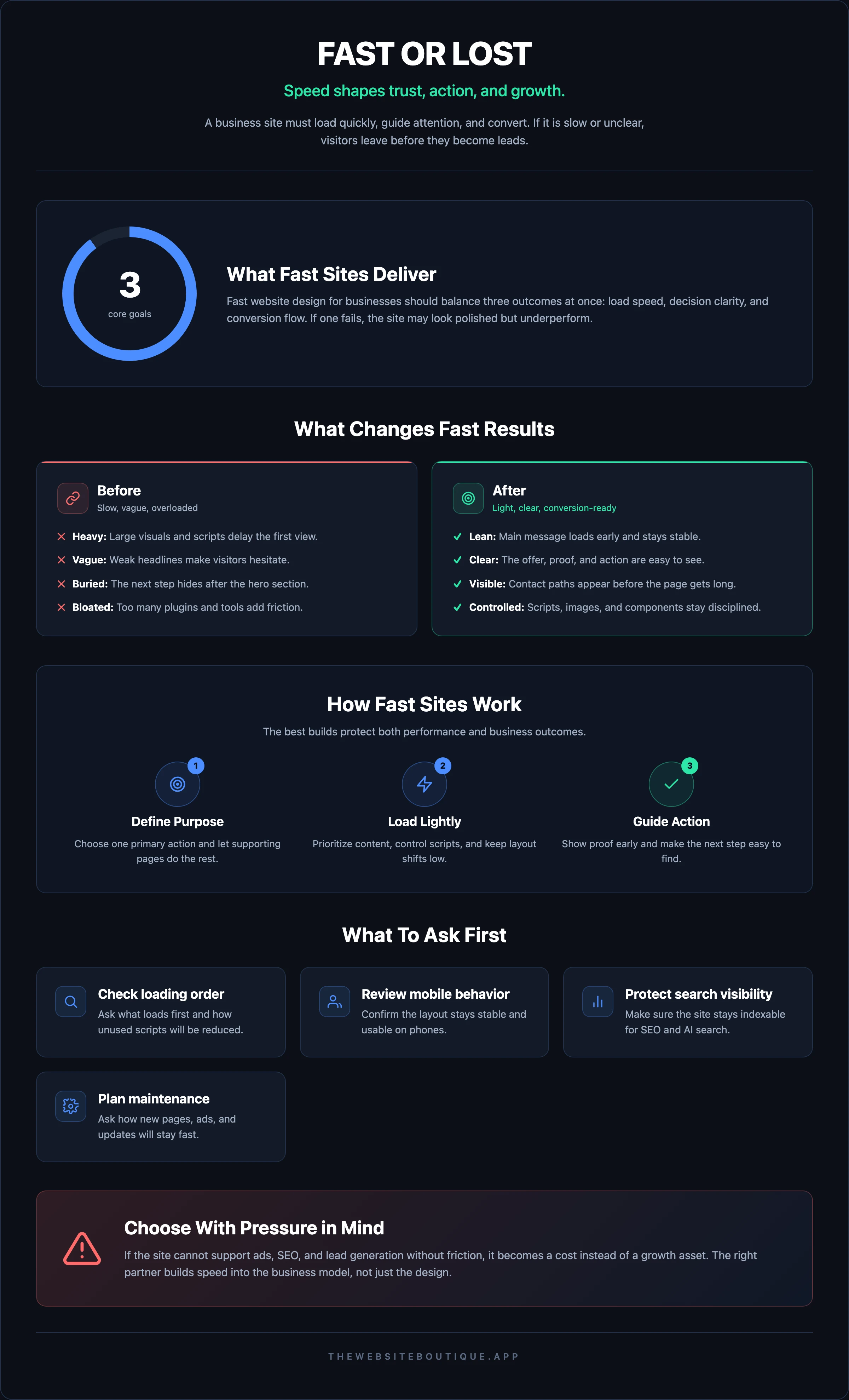
That is why fast website design for businesses should be judged on three outcomes at once: load speed, decision clarity, and conversion flow. If one of those fails, the site may still look good but underperform where it matters.
A useful way to think about it is this: the site has to work for a distracted human before it works for search engines. Google’s PageSpeed Insights helps you spot loading problems, while Google Search Central explains how technical quality and discoverability intersect. But the real question is whether the page helps a buyer move forward.
The signs a site is fast enough for real business use
You do not need perfection. You need a site that behaves predictably on modern phones, tablets, and desktops, even when the connection is not ideal. A strong site loads its main message early, keeps layout shifts low, and avoids forcing users to wait for nonessential animations before seeing a call to action.
For a business, “fast enough” also means the page can support campaigns without breaking. If your ad traffic lands on a slow homepage, your spend is working against you. If your SEO pages are technically heavy, they may still rank poorly even when the content is solid.
That is why the right provider should talk about performance budgets, content priority, image strategy, and script control, not just about visual style. When those details are missing, fast website design for businesses often becomes a slogan instead of a real capability.
The decisions that make a site fast or slow
Most speed problems begin before development. They start in the planning stage, when teams agree to too many effects, too many integrations, or too much content on the first screen. The page then becomes a pile of compromises.
One of the biggest decisions is whether the design is built around a narrow purpose. A homepage that tries to explain every service, every audience, and every proof point at once usually becomes dense and slow to scan. A better approach is to define the primary action and let supporting pages do the rest.
Another decision is how the design system is handled. Reusing components intelligently can keep the site lightweight. Rebuilding every section from scratch, or relying on an unstable mix of plugins and third-party scripts, often creates hidden friction that shows up later in performance audits.
Content choices matter as much as code
A site can be technically clean and still feel slow if the content is overloaded. Long headlines, oversized image galleries, auto-playing media, and repeated sections make the user do more work. The more effort the user must invest to understand the offer, the less “fast” the site feels.
This is where fast website design for businesses differs from generic web design. The goal is not to fill space; it is to reduce the number of decisions the visitor has to make before acting. That means clear hierarchy, concise proof, and a path to contact that is visible without hunting.
The same principle applies to internal structure. If your navigation has too many top-level items or the page hierarchy is unclear, users bounce between options instead of moving toward a lead form, booking step, or quote request. Fast sites tend to be boring in a good way: they make orientation easy.
Beware of features that slow down growth
Some features look impressive in a pitch deck and expensive in day-to-day use. Full-screen video backgrounds, elaborate motion effects, giant sliders, and multiple chat or tracking tools can hurt responsiveness. If they do not directly support conversion, they deserve a hard review.
The same caution applies to page builders that seem convenient but create bloated output. If your site depends on constant plugin maintenance just to keep the layout stable, speed and reliability become an ongoing tax. A good build should be easier to maintain than to break.
If you want to see how a growth-focused team frames that tradeoff, review the Fast websites service. It is useful as a benchmark for the kinds of decisions that separate a clean build from a decorative one.
How to evaluate an agency before you sign
A polished portfolio is not enough. You need to know whether the team can make technical choices that protect performance after launch. Ask how they handle images, fonts, scripts, and the content model. If the answers stay vague, expect the finished site to be vague too.
Start with the build process. Will they define what must load first? Do they have a clear way to reduce unused scripts? Can they explain how they will keep the layout stable on mobile? These are not niche questions; they reveal whether the team understands the site as a revenue asset.
A strong partner should also talk about search visibility. Fast sites and discoverable sites usually go together. If the team understands SEO and AI search, they are more likely to build pages that are fast, indexable, and easy for both people and search systems to interpret.
Questions worth asking in the first meeting
Use practical questions rather than vague ones:
- How will you decide which elements load first on each page?
- What will you do to keep images light without making the site look cheap?
- How do you manage tracking scripts so they do not slow the site down?
- What happens if the marketing team needs a new landing page next month?
- How will the design support search traffic and paid campaigns at the same time?
The best answers are specific. A team should be able to explain tradeoffs clearly, not hide behind design language. If they cannot explain how a site will stay fast after new content is added, the project may become harder to manage after launch than before it.
It also helps to review live examples, not only mockups. Look through use cases and clients to understand the kinds of business problems the team has already handled. You are looking for evidence of judgment, not just aesthetics.
Signs the agency understands business pressure
An experienced team will ask about sales cycles, lead quality, and who updates the site after launch. They will want to know whether the website needs to support forms, book calls, service pages, or a future ad strategy. Those questions matter because the wrong structure creates future bottlenecks.
A weaker team tends to focus on layout inspiration and visual references. That can produce a website that looks current but fails when real traffic arrives. If your company depends on speed, the agency must think beyond the launch date.
Design choices that protect conversion
A fast page is only useful if it moves visitors toward action. That means the design has to prioritize the information buyers need most: what you do, who it is for, why they should believe you, and what happens next.
In many business sites, the first screen is the weakest part. It shows a broad claim, a stock photo, and no obvious next step. By the time the visitor scrolls, interest has already dropped. Good fast website design for businesses keeps the first screen simple, useful, and specific.
You do not need a crowded homepage to persuade. You need a clear offer, a visible path, and a reason to stay. The visual style should support that goal instead of competing with it.
A conversion-friendly structure that stays lightweight
A practical structure often includes:
- A short hero section with one clear message and one main call to action.
- Brief proof near the top, such as client names, recognizable outcomes, or category-specific credibility.
- Service sections that explain what the company actually does without forcing the reader to decode marketing language.
- Supporting content that addresses objections, process, and fit.
- A contact or booking path that is visible before the page gets too long.
That structure can stay fast if the assets are lean and the copy is disciplined. The issue is rarely the existence of sections. It is the accumulation of heavy media, redundant copy, and unnecessary widgets.
If your team is generating demand through ads, this matters even more. A landing page should load quickly and match the message of the ad without friction. That is why many companies pair website work with lead generation systems rather than treating the site as a standalone design project.
Mobile behavior is not a secondary detail
A surprising number of sites still behave like desktop-first projects that were squeezed onto a smaller screen. Buttons are too close together, menus are awkward, and forms are long enough to feel like work. On a phone, that makes the brand feel slower than it is.
When reviewing fast website design for businesses, inspect the mobile experience line by line. Can a visitor understand the offer without zooming? Can they tap the contact action easily? Does the text break cleanly? If the answer is no, the design is not done.
There is also a maintenance angle here. Many teams redesign for aesthetics and forget the operational side: who will edit pages, publish content, or launch new campaigns later. If your company expects to publish often, it can help to have a simple internal reference like a glossary for shared terms and page types so the site remains consistent over time.
Common mistakes that erase the speed advantage
Some mistakes are obvious, like uploading massive images. Others are subtler. A site can pass a visual review and still lose speed because it depends on too many external tools or was assembled without a performance standard.
One frequent issue is design by committee. When too many stakeholders add requests, the page becomes overloaded with sections, language, and visual treatments that pull in different directions. The result is a website that takes longer to load and longer to understand.
Another issue is treating the homepage like a brochure instead of a decision page. If every section is trying to be a sales page, an explanation page, and a brand page at once, the reader is forced to work harder. That extra effort shows up as lower engagement.
A few warning signs worth taking seriously
Watch for these patterns:
- The agency talks mostly about design trends, not page behavior.
- Every page uses different layouts and inconsistent component styles.
- The site depends on multiple popups, chat widgets, or tracking tools without a clear reason.
- Nobody can explain how content updates will affect speed later.
- The proposal does not mention technical checks, QA, or responsive testing.
When these signs appear, the project is usually heading toward a pretty but expensive website. You may still launch, but you will spend time fixing friction that should have been prevented during planning.
This is also where a broader digital partner can help. If your team needs a site, ads, SEO, and content to work together, a growth-oriented partner like The Website Boutique can keep those decisions connected instead of treating each channel as a separate project.
A practical way to choose the right partner
The best choice is the one that fits your business reality, not the one with the flashiest presentation. If your company needs speed for ads, search, and sales follow-up, your website should be built by people who understand those pressures.
Look for a process that starts with clarity: who the site serves, what action matters most, which pages need to exist, and how performance will be protected. Ask for examples of how the team handles iteration after launch, because the first version is rarely the last.
It also helps to compare how different providers think about launch timing. Some teams prefer long creative phases with many revisions. Others build quickly and leave room for refinement based on real data. If your need is immediate and commercial, a faster delivery model can be the smarter route, especially when paired with a lean design system.
Useful ways to compare providers side by side
When you review options, compare more than price and visuals:
- Clarity of the strategy phase
- Quality of mobile behavior
- Approach to performance and technical cleanup
- Ability to support future SEO and content needs
- Ease of ongoing edits for your internal team
If you want a reference point for how a fast, business-first website engagement is structured, review pricing and the free resources available to compare expectations before you commit. That kind of transparency usually makes the decision easier.
For teams that want to see how a site fits into a larger growth plan, the blog is also useful because it shows how design, traffic, and conversion decisions connect over time.
FAQs
What is the difference between a fast website and a cheap website?
A fast website is designed to load quickly, guide attention, and support conversion with minimal friction. A cheap website is usually optimized for initial cost, which can lead to slow pages, poor mobile behavior, and harder maintenance later.
How do I know if fast website design for businesses is worth prioritizing?
If your site supports paid traffic, lead generation, search visibility, or direct sales conversations, speed affects revenue. Even a strong offer can underperform if visitors leave before the page becomes usable or clear.
Should I choose custom design or a template if speed matters?
Either can work if the final build is disciplined. The real issue is whether the structure, assets, and scripts are controlled carefully. A custom site can still be slow, and a template can still be efficient if it is simplified well.
What should I ask before hiring a web team?
Ask how they handle performance, mobile testing, image optimization, tracking scripts, and future edits. If the answers stay generic, the team may be focused on visuals instead of business performance.
Does a fast website help with SEO and AI search visibility?
Yes, because technical quality, crawlability, and user experience all influence how well a site can be discovered and understood. Fast pages also tend to support better engagement, which helps the site perform more consistently across channels.
If your current site feels polished but still loses visitors, the issue may not be your offer. It may be the way the site is built, organized, and loaded. If that is where the friction is happening, we can help you fix it with a faster structure and a clearer path to lead generation.
Explore fast websites if you need a site built to move faster from the first visit. If you want help aligning the website with search, ads, and conversion, The Website Boutique can review the current setup and recommend the next step without adding unnecessary complexity.