

Why fast website design for businesses drives conversions
August 10, 2026 · 12 min read
Fast website design for businesses can feel like a technical detail until a slow page starts costing real leads. A visitor clicks an ad, waits, taps again, waits some more, and leaves before your offer even loads. If your team is paying for traffic, that delay is not a minor inconvenience—it is a leak in the funnel.
- Speed shapes first impressions before a visitor reads a single line.
- Slow pages make ads, SEO, and referrals work harder than they should.
- Conversion problems often start with friction, not with the offer itself.
- A faster site helps mobile users, sales teams, and paid campaigns at the same time.
- Good speed work is not just compression; it is design, structure, and decision-making.
Why speed changes how people decide
A visitor does not evaluate your site like a project manager reviewing requirements. They make a fast judgment: can I trust this, can I find what I need, and does this feel worth my time? A page that loads cleanly and responds quickly signals competence before the user reads the headline.
That matters because conversion is rarely one dramatic moment. It is a chain of tiny approvals. The page loaded. The offer made sense. The form looked manageable. The next step felt safe. If any link in that chain is delayed, the whole decision weakens.
This is where fast website design for businesses becomes a conversion decision, not a design preference. The issue is not only how quickly the page appears. It is whether the visitor can move through the site without friction, confusion, or uncertainty.
A slow site also changes behavior in subtle ways. People scan less carefully when they are impatient. They may miss the main call to action, skim past proof, or abandon a multi-step form halfway through. That is why speed often improves results without changing the offer at all.
Where slow websites quietly lose conversions
The biggest losses usually happen before a visitor reaches your strongest content. A heavy hero image, too many scripts, and a cluttered mobile layout can make the first screen feel late and disorganized. If the page hesitates, users assume the rest of the experience will be just as annoying.
A few common warning signs show up again and again:
The page looks fine on desktop but feels heavy on mobile
A site can seem acceptable on a laptop and still perform poorly on a phone. That gap matters because mobile users are less patient and more likely to bounce when a page stalls, shifts, or takes too long to become usable.
The form comes after too much scrolling
If someone already knows what they want, every extra step creates doubt. Long pages are not inherently bad, but when the page loads slowly and the form sits far below the fold, the user has to keep paying attention before they have any reason to.
Visual polish hides technical drag
Some sites look premium because they are visually rich, but the experience feels sticky. Videos autoplay, animations keep moving, and scripts load one after another. The result is a site that looks modern but converts like a catalogue from a slower era.
Paid traffic lands on a page that was never built for speed
This is one of the most expensive mismatches. A strong ad can create intent, but the landing page has to receive that intent without wasting it. If the page is slow, the ad becomes a traffic source for impatience instead of leads. For teams running Meta and Google Ads with lead generation, page speed can shape the cost of every click.
Speed problems often hide inside choices that were made for aesthetics or convenience. The real issue is not “the website is slow.” It is that each extra second increases the number of people who decide they would rather leave than wait.
What fast website design for businesses changes in the funnel
When a site loads quickly, the visitor reaches the useful part sooner. That sounds obvious, but the business effect is bigger than it seems. Speed shortens the gap between intent and action, which gives the offer a better chance to work.
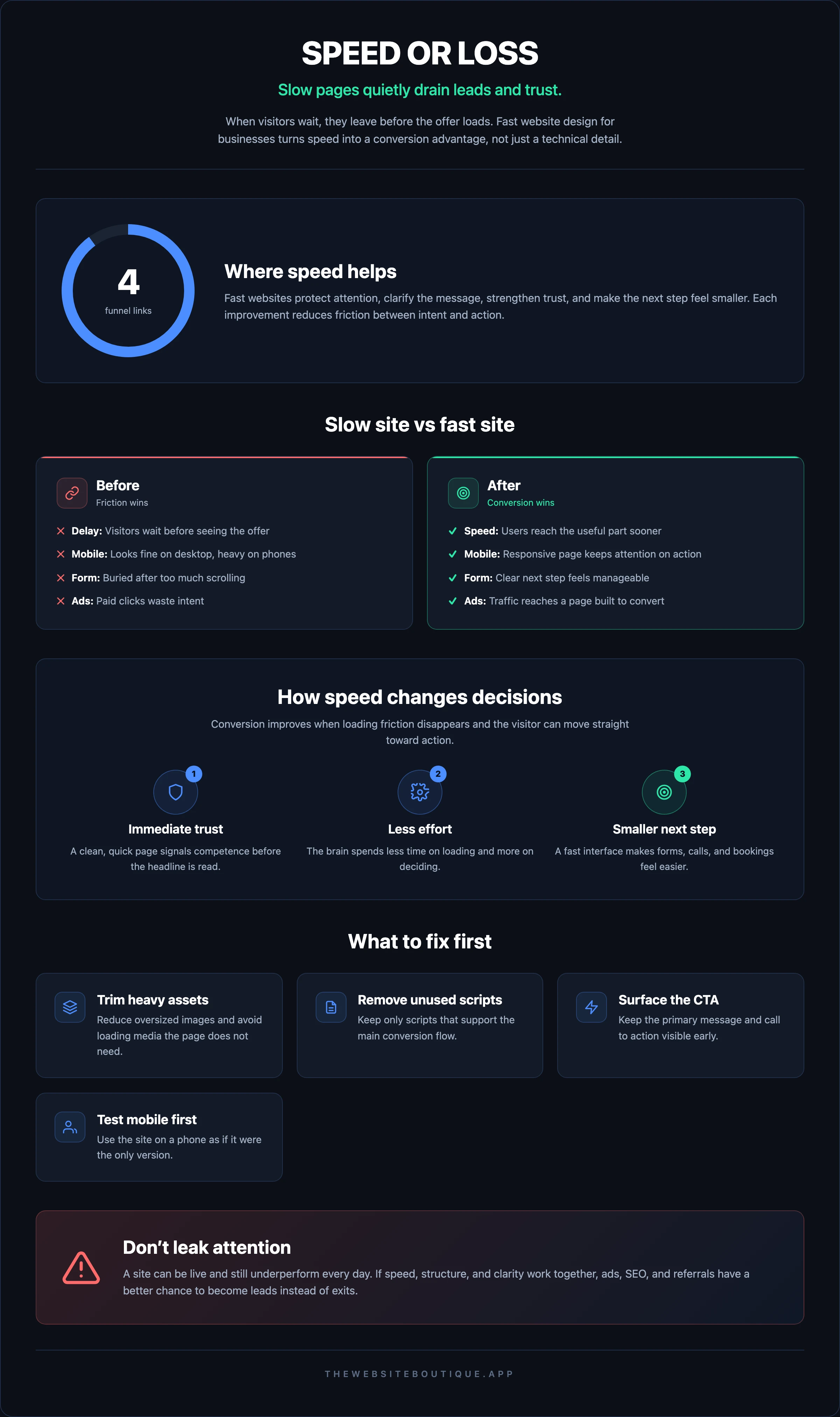
A faster site helps in four practical ways.
First, it protects the attention you already paid for. Whether a visitor came from ads, search, social media, or a referral, they arrive with limited patience. A responsive page keeps them from spending that patience on waiting.
Second, it makes your message easier to absorb. When the interface is quick, the brain spends less effort on the mechanics of loading and more on the decision in front of it.
Third, it improves the feel of trust. People often interpret speed as reliability. A clean, immediate response suggests the company is organized enough to handle their inquiry without friction.
Fourth, it helps the next step feel smaller. A contact form, quote request, or booking action looks less intimidating when the page is already easy to use.
That is why fast websites built in 2 weeks are not only a production promise. They are a reminder that speed should be part of the conversion design itself, not a cleanup task left for later.
What to fix before redesigning everything
A lot of teams assume the answer is a full rebuild. Sometimes that is right, but often the first gains come from a tighter set of decisions. You do not need to turn every page into a technical experiment.
Start with the parts that directly affect the user’s path:
- Reduce oversized images and avoid loading more media than the page needs.
- Remove scripts that do not support the main conversion flow.
- Keep the primary message and call to action visible early.
- Simplify forms so they ask only for the information you truly need.
- Test the mobile experience as if it were the only version that matters.
This is where design and development need to work together. A beautiful layout can still be inefficient if it depends on too many assets. A fast site can still underperform if the page structure makes people hunt for the next step. Good design and development of fast websites should make speed feel invisible to the user and obvious to the business.
If you want a reliable benchmark for the technical side, Google’s web performance documentation is a practical starting point. It will not design the page for you, but it does help teams understand how loading, responsiveness, and stability affect real experience.
A good rule: if a page element does not help the visitor decide, trust, or act, it should justify its weight.
How speed affects ads, SEO, and AI search visibility
Speed is usually discussed as a user experience issue, but it also changes how your traffic sources perform. A slow site does not just lose impatient visitors; it can weaken the return on every channel bringing them in.
Paid media is the easiest place to see this. When traffic comes from ads, each click has a cost and a purpose. If the landing page loads slowly, the campaign pays for attention that never matures into action. That means the same creative and the same targeting can produce weaker results than they should.
SEO feels the effect in a different way. Search engines want pages that serve users well, and speed is part of that experience. You do not need to obsess over every technical metric to see the business logic: if people struggle on the site, the site is not doing its job.
AI search adds another layer. When systems surface or summarize businesses, they favor pages that are useful, accessible, and easy to interpret. Slow, bloated pages can make that harder. If you are working on SEO and AI search visibility, speed should sit alongside content quality and structure, not behind them.
For teams that want the search side to support revenue, not just rankings, The Website Boutique treats speed as one part of a broader growth system. That approach matters because the site, the ads, and the search presence all influence each other.
What a conversion-focused fast site looks like
A fast site is not the one with the fewest pixels. It is the one that gets the right person to the right action with the least friction. That can still look polished, modern, and branded. The difference is in what the page is allowed to do.
A conversion-focused fast site usually has these traits:
The first screen answers a real question
Visitors should quickly understand what the company does, who it is for, and what happens next. If the hero section is mostly decorative, the page is wasting its strongest real estate.
The path forward is obvious
The user should not have to decode the site. Whether the action is booking a call, requesting a quote, or learning more, the next step should be simple and consistent.
The page stays stable while loading
Unexpected shifts create a feeling of mess. If the layout jumps while content appears, people are more likely to lose their place or click the wrong element.
Forms feel like a conversation, not a burden
If a lead form asks for too much too soon, the user notices. If it asks for too little context, your team pays later. A good form balances both sides and keeps the process short.
Proof appears where decisions happen
Testimonials, logos, short case references, and process signals work best near the point of action. They should support the decision rather than sit in a separate corner of the site.
If you want an example of how a business can turn a service story into a clearer digital path, Palito’s Story is a useful reference point. The lesson is not about copying a layout; it is about making the experience easier to understand and act on.
For teams comparing different operating models, Use Cases can also help clarify what kind of website support fits the sales motion, the lead source, and the buying cycle.
How to evaluate your current site without guessing
You do not need a full technical audit to spot the early problems. Open the site on your phone, click the main ad landing page, and try to complete the main action with one hand. If the page feels slow, crowded, or mentally tiring, your users feel it too.
Pay attention to three kinds of friction:
1. Waiting friction — the page loads slowly, responds late, or shifts around while appearing.
2. Reading friction — the message is buried, the hierarchy is unclear, or the page asks for too much attention.
3. Action friction — the form, button, or next step creates hesitation.
These are different problems, and they should not all be solved with more design. Sometimes the fix is simplifying a section. Sometimes it is removing unnecessary motion. Sometimes it is rebuilding the page so it performs well from the start.
If your team is deciding between improving the current site or building a new one, the question is whether speed can be made reliable without compromising the journey. That is where a focused engagement can help, especially if the site needs to support lead generation, search visibility, and a cleaner sales handoff.
A useful reference for planning and budget discussions is The Website Boutique pricing, but the more important question is whether your website can stop leaking attention at the top of the funnel.
A faster site is often a better business decision, not just a nicer one
Business owners sometimes treat website speed as a task for later because the site already “works.” It loads eventually. The contact form sends emails. The pages are live. But live is not the same as effective.
A site can function and still underperform every day. It can make ads more expensive, make SEO harder to convert, and make referrals less likely to take the next step. Once you view speed through that lens, the work becomes easier to justify.
That is also why the right partner matters. Fast website work should fit how the sales team operates, how the leads come in, and how quickly the business needs to move. About is worth reviewing if you want to understand how a senior team approaches websites as a growth asset rather than a design project.
If your current website feels polished but sluggish, the smartest move is not to keep decorating it. It is to make the path from interest to action feel immediate. That is where The Website Boutique’s fast websites can make a difference for teams that need the site to support revenue, not just look current.
Frequently asked questions
Does a faster website always increase conversions?
Not automatically. Speed helps when the offer, message, and traffic source are already aligned. If the page is fast but the message is unclear, conversions can still stall. What speed does is remove a common source of friction so the page has a better chance to work.
Is speed more important on mobile than desktop?
Usually yes, because mobile users are less patient and more sensitive to delays. They also encounter more variable network conditions. If the mobile experience is poor, many visitors will never reach the part of the page where they would have converted.
Should I rebuild my website just to improve speed?
Not always. Some sites need targeted fixes, while others are structured in a way that makes speed hard to recover without a rebuild. The decision should depend on where the delay comes from and whether the current architecture supports a cleaner user journey.
How does speed affect paid advertising results?
It affects how much of your paid traffic actually sees the offer and moves forward. A slow landing page can waste clicks by creating drop-off before the lead form or call to action appears. That means the campaign has to work harder to produce the same outcome.
What is the simplest way to tell if my site is too slow?
Use it like a customer would. Open the main landing page on a phone, wait for the page to become usable, and try to complete the primary action. If the experience feels delayed, heavy, or confusing, you likely have a speed problem that is affecting conversions.
Ready to stop losing leads to a page that loads too slowly? Start with the page that receives the most traffic and the highest-intent clicks, then rebuild the path to action so it feels fast on mobile and clear on desktop. If you want help turning speed into a growth advantage, Get a site that converts and make the first impression work harder for your business.
If your website also needs stronger search visibility or better lead flow, The Website Boutique can connect the site with SEO, AI search, and paid media instead of treating each channel separately. The goal is simple: make the traffic you already have easier to convert.